Showing posts with label Seeing Double. Show all posts

Friday, July 5, 2013

Seeing Double: The Statistical Probability of Love at First Sight

Seeing Double is a new feature here at Random Reads. Two covers. One book. One opinion. Feel free to join the discussion! :)

Ahh, The Statistical Probability of Love at First Sight (ie. the book that always makes me cringe when I have to type/write out its title). How nice it is to be able to relive last year's reading of this book! I'm still trying to get over how this book didn't woo me over because it had such a fail-proof plot! Honestly, this book was, like, written for me. But alas, I am not spending today talking about that awkward moment when you feel like you're the only person who felt disappointed with a book. Today is dedicated to another pressing matter: which one of The Statistical Probability of Love at First Sight's various covers comes out on top? Let's take a look, shall we?

Cover #1 (and most likely, the original one)

I have no shame: I read this book because I liked the cover. Yup, it's true - I am a cover fanatic (as if it weren't already obvi!). What I liked about this one in particular was the black-and-white photograph of Hadley and Oliver in the airport (though I'm not too sure about the kiss...) and then the red and white doodles. It's a super cute take on the age old practice of defacing photographs (moustaches and devil horns anybody?). But mostly, I just can't get over how GOOD the red looks on the black and white. 


Cover #2 (which I think is the British cover)

When I first saw this cover, the first thought that came to mind was, and I quote: 'Ew, I hate it.' Now? I think it has grown on me. I think a lot of my initial hate was due to the me resenting the fact that one of my favourite covers had gone through a change. That bitterness has mostly subsided and I think I can appreciate this cover, calling it 'cute' but not 'amazing' like Cover #1 is. I do like the sneakers on the cover because they look like Vans and those are my second favourite shoes. Again, we see the return of doodly font on the cover and the use of red to highlight the word, love. The only thing I don't like are the one-word reviews at the bottom. Just seems like an awkward place for something like that. But otherwise, it's nice. Cute.


Cover #3 (I think this is the hardcover edition of the above)

No point in being slow to the point so I'm going to tell it to you straight: this cover looks like it should belong on an adult romance. It doesn't have that same teenage appeal as the other two have. Especially not with the tiny figures in fancy schmany attire at the bottom. I like how they're floating among the clouds. I don't have much else to say about this. Honestly, this cover makes me yawn.


Verdict

I think it's clear that #3 is out of the running so it's between the first and the second. While I really love the red on black/white, I'm not a big fan of the kissing. But I still really, really like it. It's memorable. You're going to walk into a bookstore, see that cover and remember the title but I feel with the other two, not so much. I'm still all for the original!

What do you think? Let me know in the comments! xxx

Tuesday, March 12, 2013

Seeing Double: Anna and Lola (With an extra special cover reveal!)

Special thanks to Alex MacDuff for the wonderfully drawn glasses I snagged off his blog. Love them!

Seeing Double is a new feature here at Random Reads. Two covers. One book. One opinion. Feel free to join the discussion! :)

It's been a few days since this rocked the blog-o-sphere so you've probably been seeing this all over! Yes, I know I'm a lot late - so late that this is nearly not news. Well, I completely disregarded this fact, because it's irrelevant to my Seeing Double posts. This is not a news forum, so what do I care if this is a bit late?

PS. Today, I'm doing something a little special. Four covers. Two books. One author. Quite a few opinions. And one extra cover reveal! Hope you guys enjoy this! :)

I can still remember the first time I read Anna and the French Kiss. Though it wasn't the best book ever, it certainly stuck in my head for its quirkiness. Another thing I remember the most about Anna and the French Kiss is the cover. The old cover, as we see here that it has indeed been updated. Because the cover, along with the title, does not do Anna justice. Because so many people take one look at the title and the cover, and they just immediately shut it down. Thinking its another one of those crappy chick lits. And I would almost feel sorry for them because they're missing out on a seriously good book, but the desire to want to share this book's quirkiness is overpowering. I think I can do that now with the new gorgeous cover.

It looks amazing! I love it! It makes me want to go to Paris right now and experience  what Anna experienced for myself. I know it's not a great cover, but I love it so much more than the original. I am so happy with this cover change because this makes Anna look so much more than just a "chick lit". By the way, I hate that term. Almost as much as I hate when people are prejudiced towards a book simply because it has a bad cover and has the word kiss in it. Also, when people base their opinion on you by looking at the books you read. But that's a different conversation that we can have another day. Onto Lola!


I have never read Lola and the Boy Next Door but it sounds like a treat! And I do believe Anna makes a special cameo? Or is it Isla? Either way, I know that SOMEONE does, in fact, make a reappearance and I simply love when these occur in a book! Again the new cover looks absolutely gorgeous! I never like it when characters are revealed on a cover. It makes me feel like I have to imagine the characters in that way. I feel so restricted and really uncomfortable. Which is also my feeling towards kissy covers. Which I hate. And I'll admit, I am a big fat hypocrite because I am prejudiced as well. I tend to stay away from kissy covers because 1. they scare me, 2. people will judge me, 3. I'm not an erotica girl. Yes, I really did just stereotype. Oh covers. The stuff they do to us. Which is why you should never ever judge a book by its cover. I try not to, but it's hard you know? This is why we need cover changes, in the hope that we can attract bigger and wider audiences. And I'm especially glad that this series got redesigned. They're beautiful now!

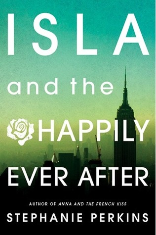
And like I promised, an extra special cover reveal that was most certainly not seen first on my blog! The long awaited Isla cover!

Ohmigod, it's so pretty! My favourite cover by far! I love the turquoise and the lime green. Ombre is so in right now! The Manhattan skyline is really pretty. And the title is the best! Really. I love the title. Oooh, I just know this is going to be such a good book! I can't wait for it to come out! I do need to read Lola first, but once I finish that, I am immediately moving on to this book, given that it's released by then. It sounds amazing!

Needless to say that I really love the new redesign of this series. I don't know how I'd live if Isla got stuck with yet another mediocre cover.

Sunday, February 24, 2013

Seeing Double: I'll Be There

Seeing Double is a new feature here at Random Reads. Two covers. One book. One opinion. Feel free to join the discussion! :)

I looovvve my features! On my review of I'll Be There, I told you guys about a little something called "Seeing Double" and today, I am premièring my very first Seeing Double post! 

Cover changes are the focus in Seeing Double and today, I'll be talking about a cover change I so wished didn't happen. I'll Be There by Holly Goldberg Sloan. 

(The one on the left is the original cover). One of the main reasons why I was drawn to I'll Be There was because of its cover. Stare at the two, and if you don't agree that the first one is beautiful, then...pbbbbbfffft. It is GORGEOUS. And now that I have read the book, I know how much it relates to the story. When you read this book with that cover, you connect. Because every time you read it, you see Sam and Riddle on that cliff. That cliff that changed their entire life. You see hope, you see love, and you feel for them. If only I had the chance to read I'll Be There with that cover, I can bet you that I would've felt a whole lot more. 

On the other hand, the second cover, is something I would like to call a train wreck. Don't get me wrong, it's not ugly, it's just...wrong. What do boots have to do with the book? Or a butterfly??? I certainly do not recall reading about any of those items in the book. Perhaps I'm being too literal or perhaps I'm interpreting it too simply but it doesn't make sense. I don't get it. I don't feel anything towards it. What is the significance of that, I don't understand! Comparing it to the original cover, I really wish the artists would have really thought the second cover through. It's terrible because I don't feel it does the book justice. The font is nice, though. 

Definitely prefer the original cover, though the second cover was the one I read the book with, so I can't flat out hate it. I still wish they hadn't changed the cover, even though this happens all the time. I really miss seeing the original in bookstores and libraries. C'est la vie.